
When the folks at Fabric joined Firebase earlier this year, we aligned around a common mission: provide developers like you with a platform that solves common problems across the app development lifecycle, so you can focus on building an awesome user experience.
One area — among many — where Fabric excelled was in its console and dashboards. We’ve been hard at work for the last several months, working with them to bring together the best parts of Fabric and Firebase. Today, we’re excited to share some improvements to the Firebase console.
Updates
Redesigned navigation
We started by redesigning the navigation, to more accurately reflect the way your team works. We’ve clustered Firebase products into four groups: Develop, Stability, Analytics, and Grow. All of the products that you’re used to seeing in the Firebase console are still there; we’ve simply reorganized them in a way that makes it simpler to navigate between them as you use more products across the Firebase platform.
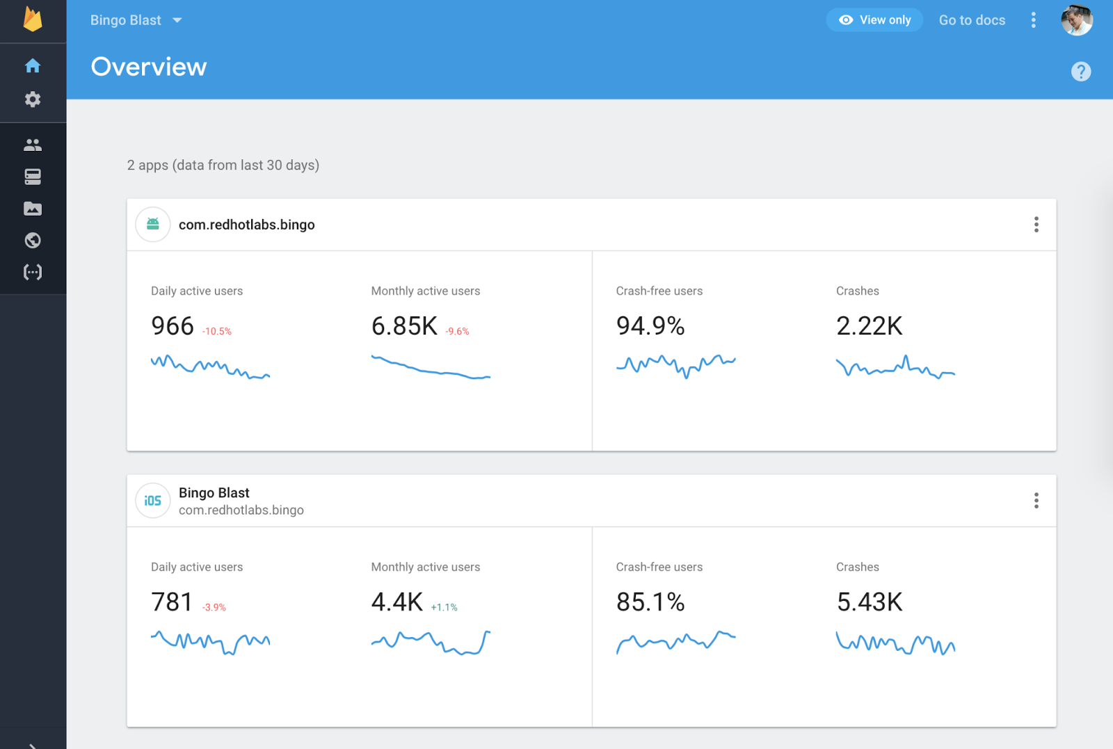
New Project Home
We’ve also redesigned the Project Home screen in the Firebase console to bring a few important metrics front and center. Now, when you first open a project in Firebase, you’ll see four key metrics: 30-day crash-free user rate, 30-day crashes, daily active users, and monthly active users, along with graphs that displays these trends over time. In research, we found that the vast majority of the time, developers are looking for one of those four metrics, so we made them easily accessible from the Project Home landing page.
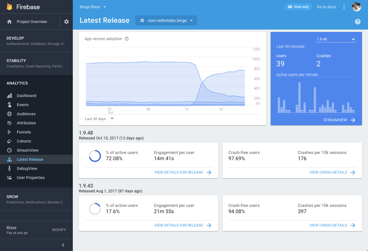
Latest Release
Another well-loved Fabric console feature is the Latest Release section. This dashboard gives you all the most important insights from your most recent app release, so you can get a quick snapshot of what’s going well and what might need to be rolled back. We’ve brought this section into the redesigned Firebase Console; you’ll find it under the Analytics section of the navigation bar.
Updated Analytics dashboard
Starting today, you’ll also see an Analytics dashboard that is organized into simple cards underneath an easy to understand question. Organizing data around jargon like “DAUs” or “retention cohorts” is difficult to navigate, so we’ve restructured the dashboard around questions you have about your app, like “where are my users engaged?” Or “how well do I retain users?” Our research confirmed that 90% of users preferred this design and we hope you find it helpful too!
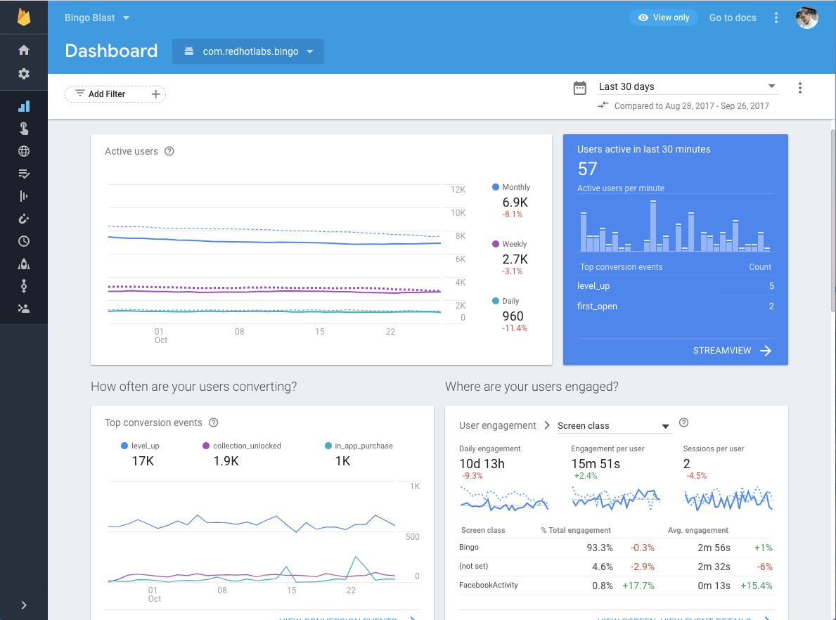
Realtime information
Another thing we’ve learned from our friends at Fabric and heard from all of you is that having information in realtime is critical. Whether you’re tracking a new app release or monitoring the status of a bug fix, you need to understand what’s happening in your app in realtime, so you can make changes and prioritize work accordingly.
To help with this, we’ve added realtime data on crashes and active users to a card that you’ll see in the new Analytics dashboard, as well as the Latest Release section of the console. This is just the first step and, over time, we plan to make realtime data more prevalent across the rest of the Firebase console.
Reach out
As always, you can contact us at https://firebase.google.com/support/ with feedback and questions. Happy building!