_466x466.webp?alt=media)
Our commitment to delivering a trusted developer experience extends beyond aesthetics. So, when we took on the task of adding dark mode to the Firebase Console, we wanted to make sure that the interface provides easy-to-read text and reduces eye strain as developers move between their IDE and the console, improving the visual ergonomics for both the light and the dark theme. As we worked through the design, we took particular care to ensure the updates met or exceeded accessibility standards to create the best experience for all users.
Sharing our learnings as we introduce Firebase Console Dark mode and light theme refresh
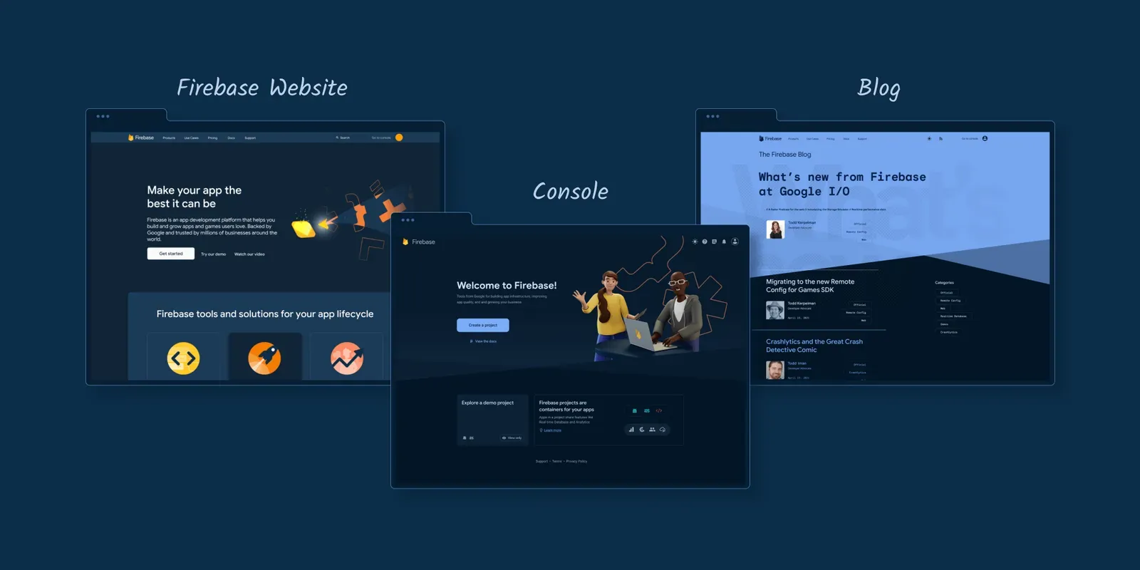
We’d initially assumed that developers prefer a single mode across their surfaces, but we quickly debunked that as we started looking at documentation flows in dark mode. While dark mode purists absolutely wanted everything they viewed to be available in a dark theme, a significant set of users enjoyed a dark console but strongly preferred the light theme for reading documentation. To support as many of our users’ preferences as possible, we made the options independent. Since we know a lot of you in our developer community are also building your own apps with dark themes, we thought this would be a great opportunity to share some of the learnings we made along the way from design to implementation.
Design Tokens
Previously, colors in Firebase console were defined using three different systems:
- Hex color codes
- Token system 1
- Token system 2
We took this opportunity to unify our token systems into one by creating a 3rd token system. We even used these tokens in other surfaces such as our docs site and emails. Woohoo!
Now, colors are defined by the new token system. We built this token system using CSS variables and included the ability to change the value of the token based on mode.
We used host context to change the value of the token, depending on dark or light mode.
:host-context(body.light-theme) {
  -–page-bg: light-grey;
}

:host-context(body.dark-theme) {
  -–page-bg: dark-navy;
}

// page.scss
background-color: var(--page-bg);
Design Process
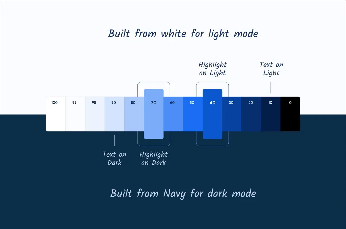
An initial developer request to support a dark theme for Firebase inspired the overall design refresh. We began by redesigning our existing UI with darker colors, and we focused heavily on accessibility, ensuring high legibility and contrast while still feeling relaxed and balanced. We avoided using pure black backgrounds with pure white text, leaning instead on Firebase brand-friendly dark navy and pale blues. These colors are not only delightful and unique to the Firebase brand, but help us achieve our accessibility goals.
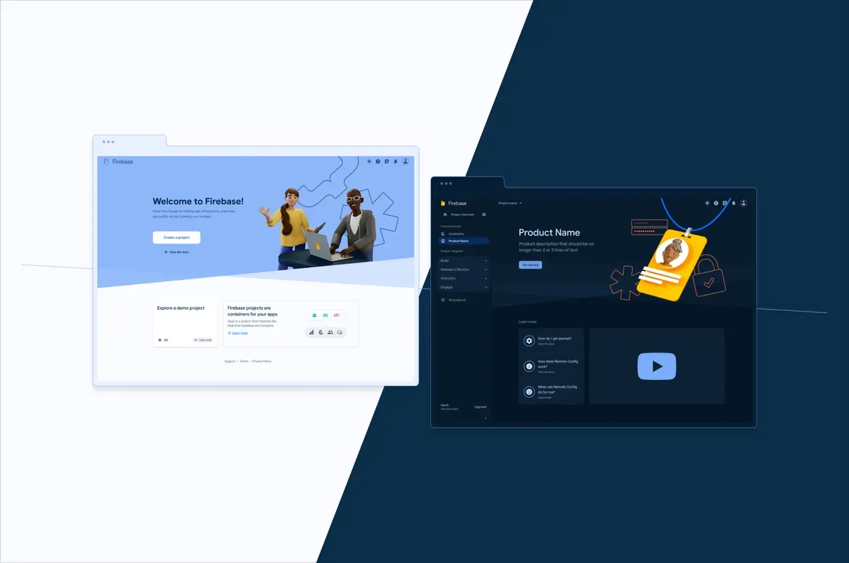
While working on dark mode, we took the opportunity to refresh our light mode with a fresh and lighter color palette. We lightened some of the contrasting darker elements in the console. The experience feels much lighter and fresher, and we think people will be as delighted with the new light mode as they will be with dark mode.
Color System
To ensure harmony between the light and dark themes, we used one shared color system. We closely collaborated with our frontend engineering team to ensure that what we see in our mock-ups and production code are the same and that our colors can be easily updated in the future. Ultimately, this actually simplified our color system even though it covered two themes instead of one.
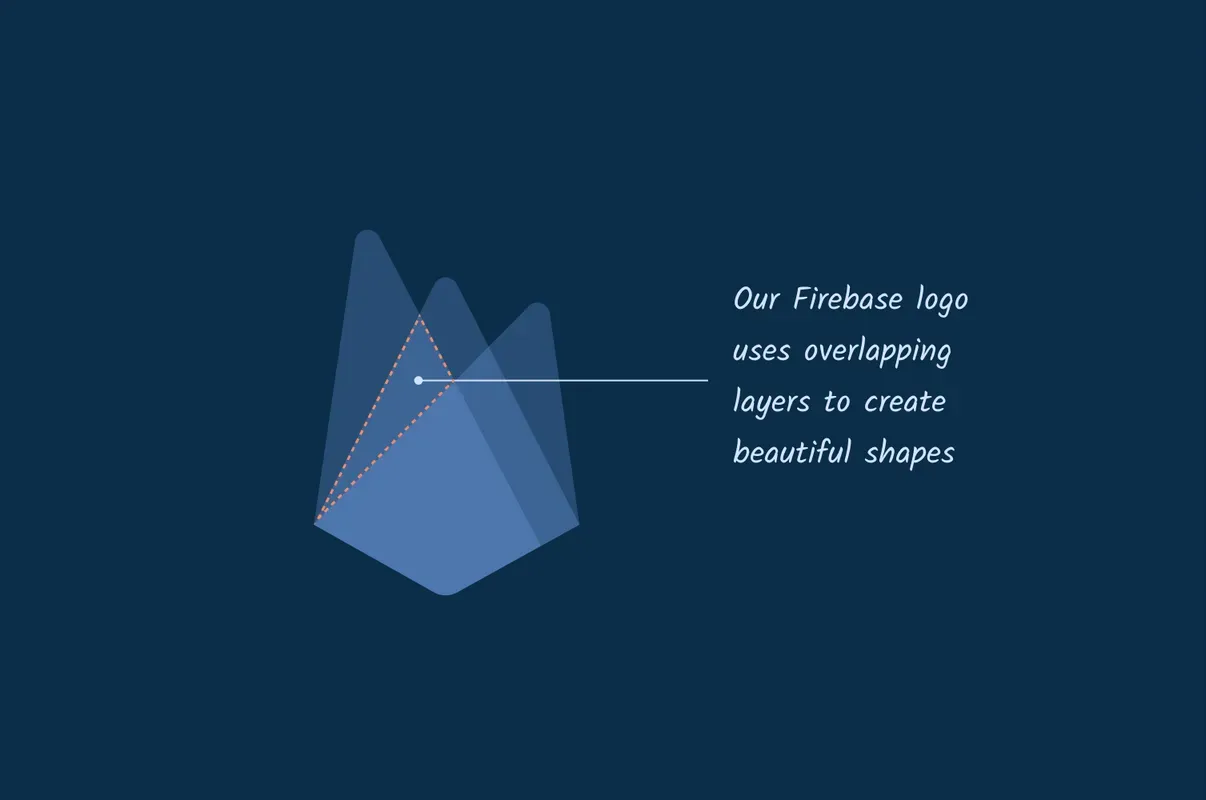
Background cuts and new illustration style
We continued to refresh the UI by adding a new background cut element at certain key moments in the Firebase console. The background cuts are inspired by the Firebase logo, specifically the unique shapes created by overlapping layers.
And finally, we updated all our product and onboarding illustrations to create a complete visual refresh across both light and dark themes.
We hope you enjoy using our design refresh as much as we enjoyed creating it :)
Design - Switching between dark and light
There are many examples of different ways to design the toggle from solely relying on the system setting to only offering the dark/light toggle, and offering a simple toggle in the nav or simplifying the UI with the switch in user settings. In talking with developers and watching social media debates about whether a light or dark theme was better, it was clear that a flexible approach with easy access for switching was required. With three options — dark, light, and device default — displayed in the nav bar, each user can control the interface whether they always want to use a specific mode or use their system settings to manage their experience.
Dark theme has taken over and this long-requested feature from our community is now available. With this stylish visual refresh, we are bringing the option to use dark mode to the Firebase console and delivering a modern look for light mode. We think you’ll have the opportunity to enjoy them both depending on whether you’re spending the day on the patio tweaking a few settings or coding deep into the evening. And thus, the debate continues, which IS better — dark theme or light?